Goodbye 2009. In fact, goodbye to the 00's. Some have taken to calling them "the aughts", but I prefer "the ohs".
One of the more interesting features of the end of this year, is that every publication is putting out "best of" and "worst of" listings of the past 10 years rather than just the past year. As usual, most of these are crappy fluff pieces that aren't really worth the time, but I've definitely come across a few interesting ones and it's interesting to look back to 1999 and see how much things have changed.
Thursday, December 31, 2009
New Years Eve
Big AND Ugly
Wherein I angrily bash the uselessness which is the ROM Crystal.
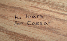
I really hate the ROM Crystal. In case you don't know what I'm talking about, the Michael Lee-Chin Crystal is the ridiculous extension to the Royal Ontario Museum. I've hated it since it opened. Actually, I hated it before that, both during construction and when I first saw the design, scrawled on a napkin by the architect!
So, I've found it highly amusing and vindicating that the world has begun to catch on to this building. In November, Virtual Tourist placed it in the top 10 ugliest buildings in the world. This got a nice follow up a few days ago when the Washington Post placed it as the worst architecture of the decade.
"Daniel Libeskind's addition to the Royal Ontario Museum in Toronto surpasses the ugliness of bland functional buildings by being both ugly and useless. His aluminum-and-glass-clad crystalline forms grow out of the building's original 1914 structure, and from the street it's dramatic. But go inside and you need a map to move around its irrational and baffling dead spaces."Awesome. I personally hate it mostly because it's hideous, but there are other roots to my dislike. For one, I also find it a horrible waste of space as the interior is filled with odd angles and sloped walls that must make placing out an exhibit an incredible headache. I also think it goes very poorly with the rest of the century-old building, not looking like an organic structure growing out of the old brick, as I've heard some ridiculously describe it, but more like a crumpled piece of tinfoil thrown over top.
A lot of my friends though liked it, or at least, liked it in the beginning. During construction I would complain about the ugliness of it, and those friends would either tell me how nice it would look when completed, or that they were happy for a building that just looked "different". Most of them came round to my way of thinking by the time it opened, and most of those who didn't have slowly found their way into my camp. "Different" can be good, but butt-ugly rarely is.
Many have commented that they expected the "crystal" to actually be made up of glass and were upset to discover the aluminum monstrosity that was given to us (comments to this blogTO post show many examples). Apparently the original design called for that, as this Globe and Mail article from the time of the crystal's opening indicates:
"Had it been clad in glass with the cacophony of steel beams exposed to the public, the museum would clearly represent an astonishing triumph.I was not one of those surprised by the lack of glass. I also don't lament that we could have had a nice looking glass building but were instead given this. Firstly I think that a glass crystal would have looked almost equally as dumb, but I also feel that if the original plan really did call for glass, it just further show cases the stupidity of the design!
.....................
But glass is an expensive and unreliable cladding to use as a roof in any Canadian city. And steel beams are not absolutely fire-resistant. None of this was fully appreciated when Libeskind submitted 11 drawings on ROM napkins of a glass, crystalline addition for the invited design competition."
MUSEUMS HAVE THINGS IN THEM THAT SHOULD NOT BE CONSTANTLY EXPOSED TO DIRECT SUNLIGHT!
Any building design that in no way works for the purpose of that build is useless, regardless of whether the design looks good or not (which in this case it doesn't!). That and the fact that the shape and design of it required contractors to go to great lengths to build it to withstand Toronto weather, and your left with something both ugly AND functionally stupid.
Oh yes, and it also breaks city bylaws for encroachment into public space. Congratulations.
Wait, and did that quote just say something about napkins? Yes it did.
"when Libeskind submitted 11 drawings on ROM napkins of a glass, crystalline addition for the invited design competition."I saw the napkins on display at the ROM when they were advertising their soon to be started expansion. I was unimpressed and bewildered. He handed them his design scrawled on napkins and they accepted that?! Who the hell is he? And who the hell are these people who went with his idea? Lame.
So, as you can see, I passionately hate this building. Don't get me wrong. I love the ROM itself. I like the exhibits. I love to go there. But every time I look at this thing I cringe and I'm happy that I'm not the only one.
Sunday, December 13, 2009
Thursday, December 10, 2009
More Band Names
- EMR Outputs
- The Endless Contract
- Standardization of Terms
Sunday, December 6, 2009
A Man Who Loves His Job
At a club last night. Weird music night. My wife made a request. The DJ:
"Oh ya. I need to play this shit a while longer, but I'll play that. Don't tell anyone that I'm going to play it...(quietly) but I'll totally play it"


